Museus
Transforming the Cultural Exploration and
Enhancing the Way to Discover Toronto's Rich Heritage


The Museus App project is initiated to address a significant gap in the cultural exploration landscape within the vibrant city of Toronto. Despite the city's rich cultural heritage and numerous museums, galleries, and historical sites, residents and visitors are facing challenges when seeking comprehensive, user-friendly resources to discover, engage with, and access these cultural offerings.
This was a personal project spanning 4 months that I did during my college year. Throughout its duration, I received invaluable feedback from mentors with expertise in the art and culture industry, as well as constructive comments from my instructors, all of which greatly contributed to the development of the solution.
My Role
-
Ideation
-
Concept
-
UX Research
-
UI Design
Team
I am the sole Product Owner, Product Designer, Project Manager, and UX & UI Designer
Tools
XD
Illustrator
Miro
"As someone new to Toronto, I was eager to discover the city's museums and cultural events. However, I struggled to find a user-friendly website for easy exploration."
As a newcomer to Toronto, I quickly realised that finding information about museums and cultural events in this vibrant city was more challenging than expected. Faced with this hurdle, I was inspired to embark on a journey of discovery and explore innovative solutions to make the exploration of Toronto's rich cultural offerings more accessible and enjoyable for all the people, including newcomers like myself.
1. Why does it matter?
To validate my idea and to ensure that addressing the issue was worthwhile, I conducted research interviews with the primary users to explore any pain points that they were experiencing with the existing user journey of exploring cultural sites and events in Toronto.
My research encompassed:
-
Understanding the user goals and needs
-
Uncovering pain points with the existing user journey
Persona
Based on research, I recognised that there were 2 primary user types. I then developed detailed personas based on the information collected during user interviews. Each persona represents a user group with its own needs, goals, and pain points. It Includes demographic information, behaviours, and any other relevant details that help humanise these personas.
-
Museum enthusiasts and individuals who are interested in exploring cultural sites

-
Museum and Cultural Sites

Journey Map
I also created user journey maps for the first persona which my product would mainly dedicate to, to visualise their experiences and pain points throughout their interaction with the current journey to highlight the touch points where the Museus app can provide solutions or improvements.


2. What is the problem?
Key Issues
-
Lack of User-Friendliness
The current websites available on the Internet lack an intuitive and user-friendly design that is challenging for users to navigate and find the relevant information they need. The navigation paths are complex and confusing, which hinder users from exploring the places of interest effectively, thus discouraging people to engage in cultural appreciation and understand the city’s cultural identity and heritage.
-
Ineffective Search Functionality
Some of the websites are missing effective search functionality, including search engine, filtering, and sorting options for museum or cultural sites. It leads to difficulties for users to effectively find specific venues in particular locations or categories, and they may encounter irrelevant information to find their desired results.
-
Scattered Information
The available information is scattered on different websites, making it inefficient and complicated for users to get comprehensive information and access necessary details of the museums or cultural places.
-
Insufficient Information
The current websites often lack sufficient essential information, such as opening hours, ticket prices, exhibitions, amenities, or accessibility information. Users may be left with unanswered questions or uncertainties, hindering their decision-making process and reducing their confidence in visiting cultural sites.
-
Reliance on External Searches
Due to the key issues mentioned above, it would require users to conduct more research on external sites to gather more comprehensive information, which makes the search process longer and causes a fragmented user experience.
Problem Definition
"There are no existing platforms dedicated to museums and cultural sites within Toronto's neighbourhoods. Meanwhile, the existing online resources are lacking user-friendliness, making it difficult for people to search and explore nearby places of interest. The information provided is scattered and often insufficient, requiring users to conduct additional online searches on their own, thus discouraging people to explore around, declining cultural engagement, and causing a loss of connection to the city's cultural identity and heritage."
3. Ideation
Considering the problems identified above, I have taken steps to tackle these issues by ideating potential solutions.
-
A centralised platform for museums and cultural sites in Toronto
-
Streamlining the journey of cultural exploration, including sites and events
-
Additional features of community engagement and personalisation
Finally I came up with the solution of creating an app called Museus app, which is a centralised platform for museums and cultural sites in Toronto. It would allow effective exploration, community engagement, and event discovery, thus fostering cultural appreciation and understanding. Users can explore sites, book tickets, access or create user-generated content, and immerse themselves in the city's cultural identity.
The app will empower users to explore Toronto's cultural offerings at their convenience, make informed decisions about which sites and events to visit, and seamlessly purchase entry tickets. By leveraging advanced personalisation algorithms, the app will provide tailored recommendations based on user preferences, enhancing user satisfaction and encouraging continuous engagement.
4. Design and Build Solution
I created a site map and mocked up some basic wireframes to establish a standardised hierarchy and layout for the app interface. Then based on the wireframes and comments gathered from my classmates and instructors, I developed the prototypes of the Museus app.
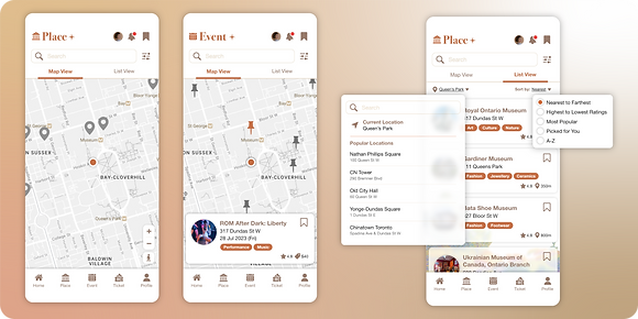
Site Map

UX Theme

Wireframes


Prototype

5. Testing
After finalising the prototypes, I conducted user testing with the primary users as well as my mentors with art and culture backgrounds to verify whether the new designs effectively address their issues. During the session, I observed how they interacted with the prototype and what issues they encountered.
I also had heuristics reviews with my classmates to examine the design against a set of usability principles to uncover potential usability problems that might frustrate users or impede their task completion.
Heuristics | Review from Classmates |
|---|---|
10. Help and documentation | Didn’t see any help and documentation information, but the app is easy to use and straightforward and I don’t have any difficulties or frustrations. |
09. Help users recognize, diagnose, and recover from errors | No errors were found at this moment. |
08. Aesthetic and minimalist design | Using simple graphics to represent some information e.g. accessible, and parking spots. |
07. Flexibility and efficiency of use | Easy to use and navigate, with enough functions. |
06. Recognition rather than recall | Can put some event information into places e.g. ongoing event name, so users don’t have to click to know what is the latest event now. |
05. Error prevention | 3 steps to buy a ticket, which has enough time for users to change their decision. Also there is a slide button to confirm the last purchase by preventing users clicking accidentally. |
04. Consistency and standards | Words and phrases are easy to understand and consistent. |
03. User control and freedom | Exit button is included in most of the pages, and users can click on the blank spaces to exit if there is no such button. |
02. Match between system and real world | Information orders are logical and make sense. Maybe all transit methods can be put together, or else the contents are a bit wordy. |
01. Visibility of system status | Loading time is reasonable and no errors were found. |