FundVantage is a funding intelligence solution for Canadian enterprises. They provide external and internal funding Programs, and personalised reports to their clients based on their needs. The client would love to have an assessment of the platform from a UX/UI perspective in both design and content to help the developers tackle the improvements needed and refresh the platform.
This 4-month-long college project was a collaborative effort involving my fellow classmates. We worked closely together to develop the solution, guided by the instructions provided by our college instructors.
My Role
-
UX Research
-
UI Design
Team
A collaborate team of 5 students well-versed in interactive media management
Tools
Figma
Illustrator
Miro
1. Understanding the problem
In our initial meeting with the client, we gathered insights into their project requirements, overarching goals, and specific expectations. Following this, we defined the roles and responsibilities of all teammates involved, launching the first phase of the project. This initial phase centred around a comprehensive assessment of the existing website's challenges and an examination of the competitive landscape.


2. Defining the problem
After gathering the insights from the research, we concluded that:
-
The layout of the website is outdated and lacks modernisation.
-
Public pages are not easy to navigate and some content needs to be rewritten and omitted as the copy on the website is lengthy.
-
The website also lacks a hierarchy of content and emphasis on important stuff although it has a lot of potential.
3. Ideation
From the findings, we decided as revamp the website with key business goals:
-
Improve User Experience by enhancing the website's user interface to make it easy for users to find and apply for funding opportunities.
-
Establish the website as a trusted source for funding information and opportunities.
-
Maintain consistent, high-quality, and effective content on the website.
Meanwhile, the scope of work would only focus on the homepage of the public page, dashboard of the user portal, and the funding information page.
4. Design the solution
We had meetings with the client to discuss our findings and ideas for the website revamp, then we started to create style guide and wireframes to visualise the new website revamp and establish a hierarchy and layout of the website. We also created writing guidelines to serve as a set of rules, recommendations, and best practices for the content on the website.


5. Testing
After developing and finalising the prototype, we asked our college instructors to review our design and test on the prototype. Incorporating the recommendations provided, we enhanced the user portal's navigation bars and revamped the layout of the user dashboard. These changes were made to create a more personalised and user-centric experience.
Propose Solutions
Content Strategy
-
Ensure consistency in style and tone, and make the content on website more accessible and understandable to the audience
-
Create a more marketing standpoint, effective and engaging written content, that the message is conveyed to resonate with the target audience
.jpg)
.jpg)
.jpg)
Mockup
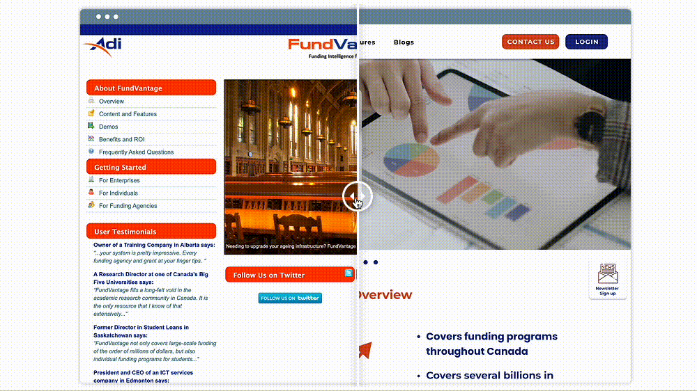
FundVantage Homepage
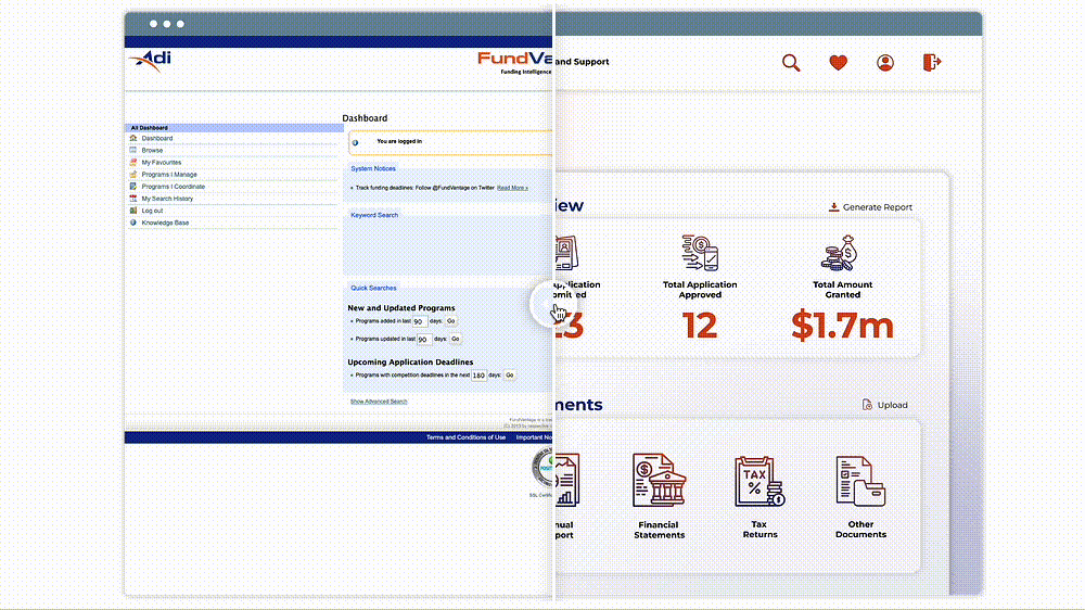
Customer Portal Dashboard
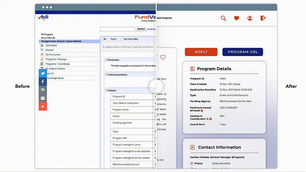
Funding Programme Detail Page